Dancing Goats® Coffee Roasters
CASE STUDY
SCOPE OF WORK:
Creative Direction | Brand Design | Package Design | Website Design & Maintenance | Campaign Marketing Strategy
PROJECT BRIEF:
Dancing Goats® is a coffee company that oozes passion and character, but its digital identity and packaging failed to reflect the brand behind it.
ABOUT THE BRAND:
Dancing Goats® began in 1988 in the Pacific Northwest as a warm & friendly cafe for coffee lovers, but never quite found its footing as a coffee roaster. While bouncing around with different roasting vendors, the owners began opening cafes in Atlanta in 1994, making connections and building relationships as they grew.
THE CHALLENGE
With almost 40 years of experience and coffee farm relationships, Dancing Goats® was due for a new direction as a coffee roaster in the Southeast. Despite a technical identity crisis, the company attracted passionate, creative, coffee lovers, and naturally formed a brand identity. And so, when Dancing Goats® became Dancing Goats® Coffee Roasters, a new visual packaging system was necessary and highly anticipated.
OBJECTIVES
Solidify brand identity
Embrace what makes DG special
Update packaging, voice, website, and brand guidelines
Create a foundation for future expansion, such as cafe remodels and build-outs
My Role & Team
As both Creative Director and Art Director, my mission was to solidify Dancing Goats® Coffee Roaster’s brand identity and move forward in a crowded coffee/cafe industry with confidence.
Copywriting and Brand Strategy: Rob Wilhelm
Social Media Management: Rachel Mackin
Photography: Aaron Johnson, Jonah Walker, Amanda Shively

BRAND IDENTITY & evolution
There were 4 key words/phrases that I focused on during this brand refresh: approachable, deeply rooted, character, and qualified. These words came from my own experiences with the brand, both observing and creating for it, as well as my interactions with the people and spaces that are foundational to today’s Dancing Goats.
Approachable
Dancing Goats® is full of friendly faces ready to welcome you in - both into a cafe and into the world of coffee. Discovering specialty coffee can be overwhelming, but not at DG.
Deeply Rooted
DG has a rich history that we want to honor - from its birth in the Pacific Northwest, to its B Corp status and sustainability initiatives, to its artful logos and marks, DG has a story. (Roots also refers to the outdoorsy/nature elements of PNW and sustainability).
Character
There is an endearing, charming personality to Dancing Goats that sets it apart - the colors, the aesthetic of the Goat and the cafes, the quirky mugs. We don’t want to lose the essence of that character because it feels comforting, approachable, and playful.
Qualified
DG has been in specialty coffee for almost 40 years, with long lasting farm relationships, dedicated roasters, and selective sourcing. We don’t want the “playful” elements to overshadow how qualified DG is to serve quality coffee.
BEFORE
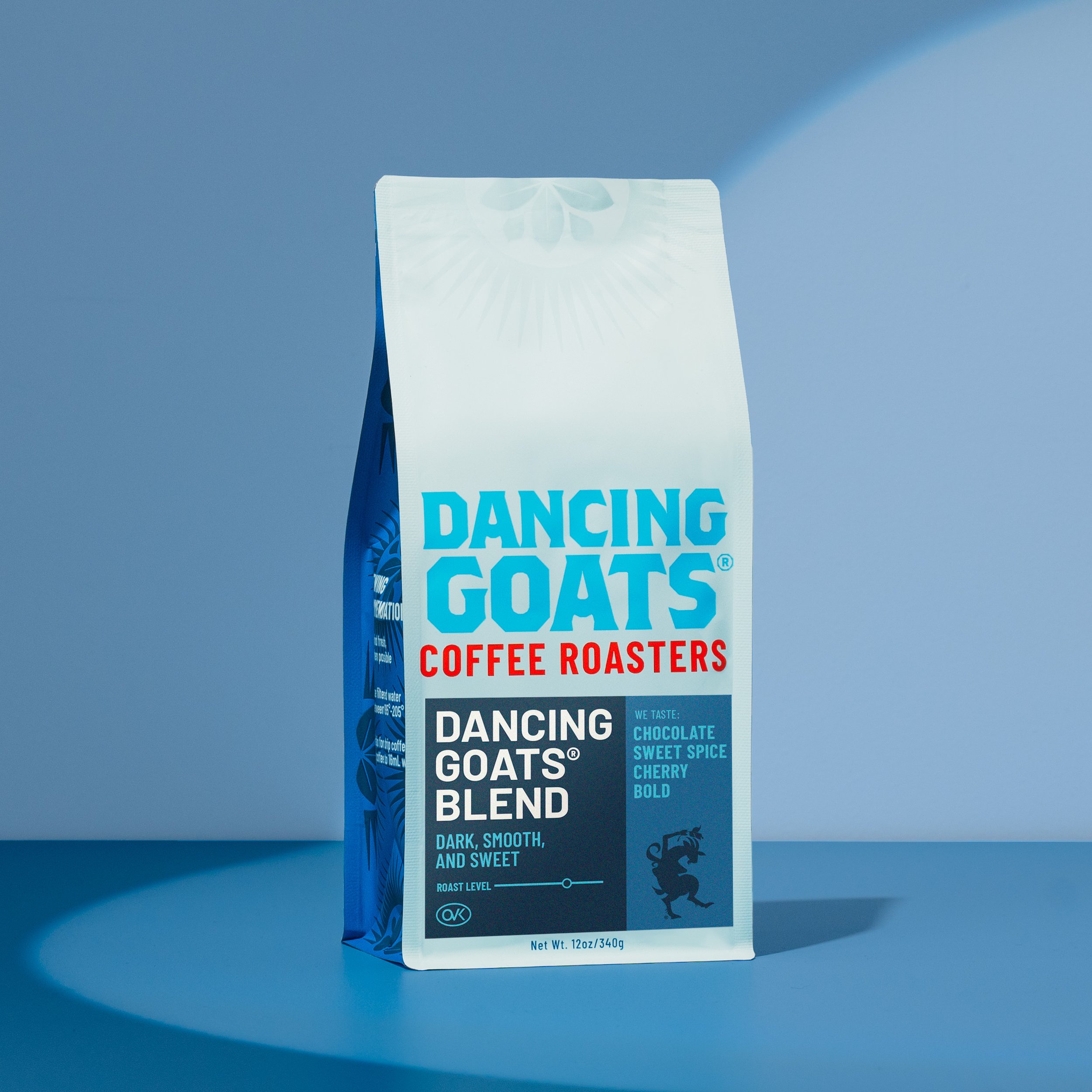
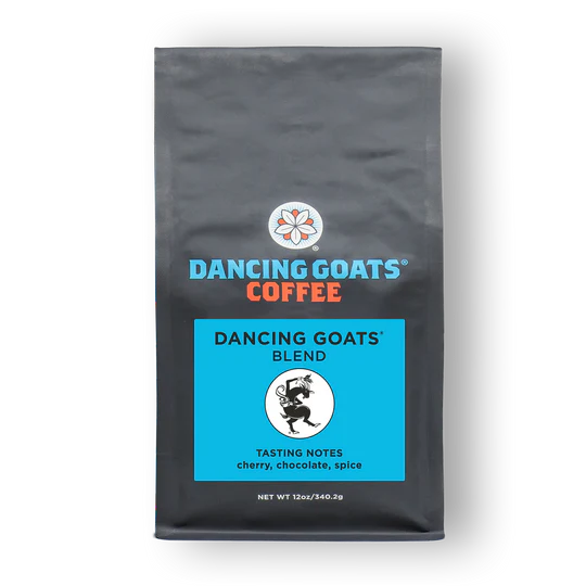
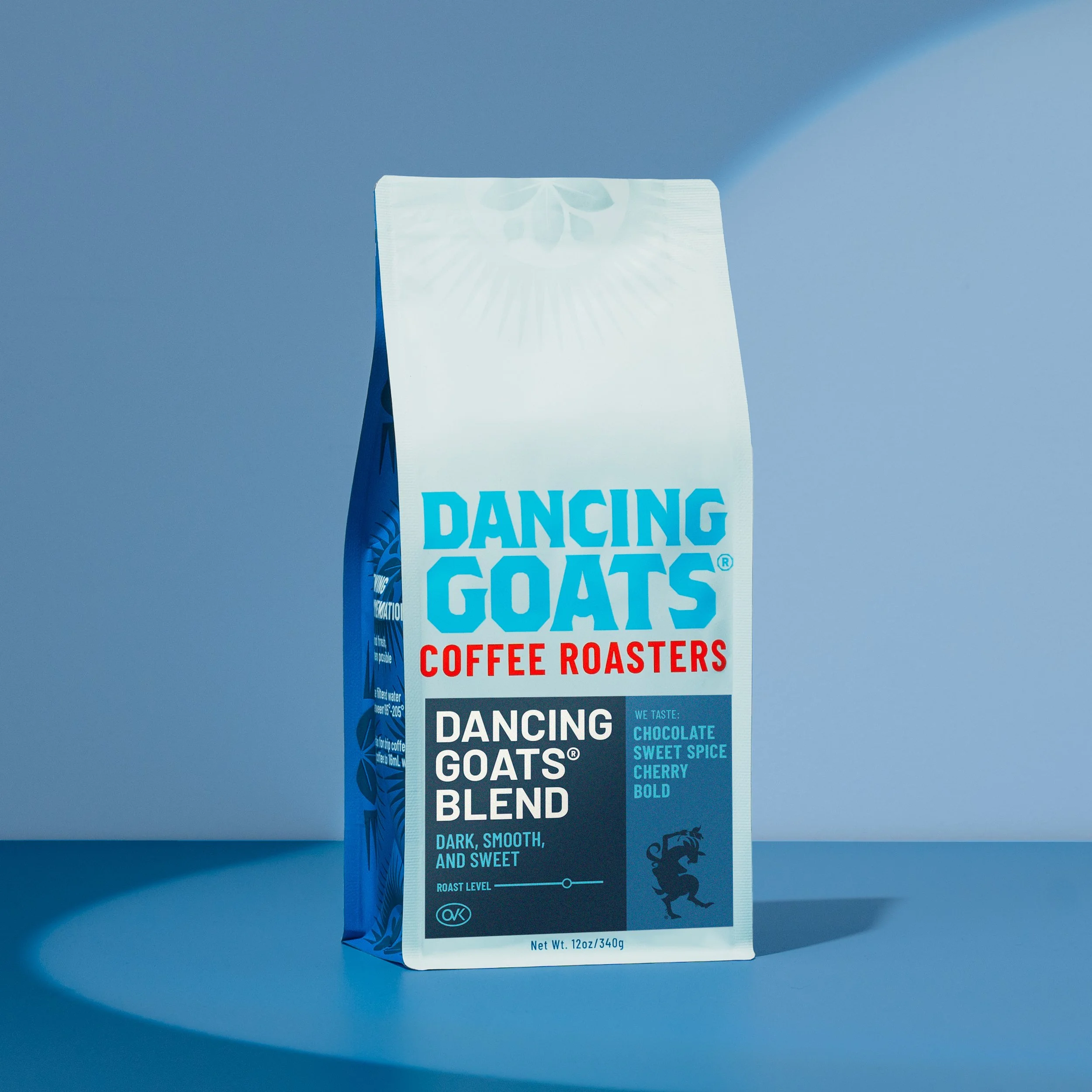
When DG committed to moving forward with their own roasting company, they needed packaging that declared that transition. However, they kept the “corolla” flower mark from their previous roaster as well as many other elements.
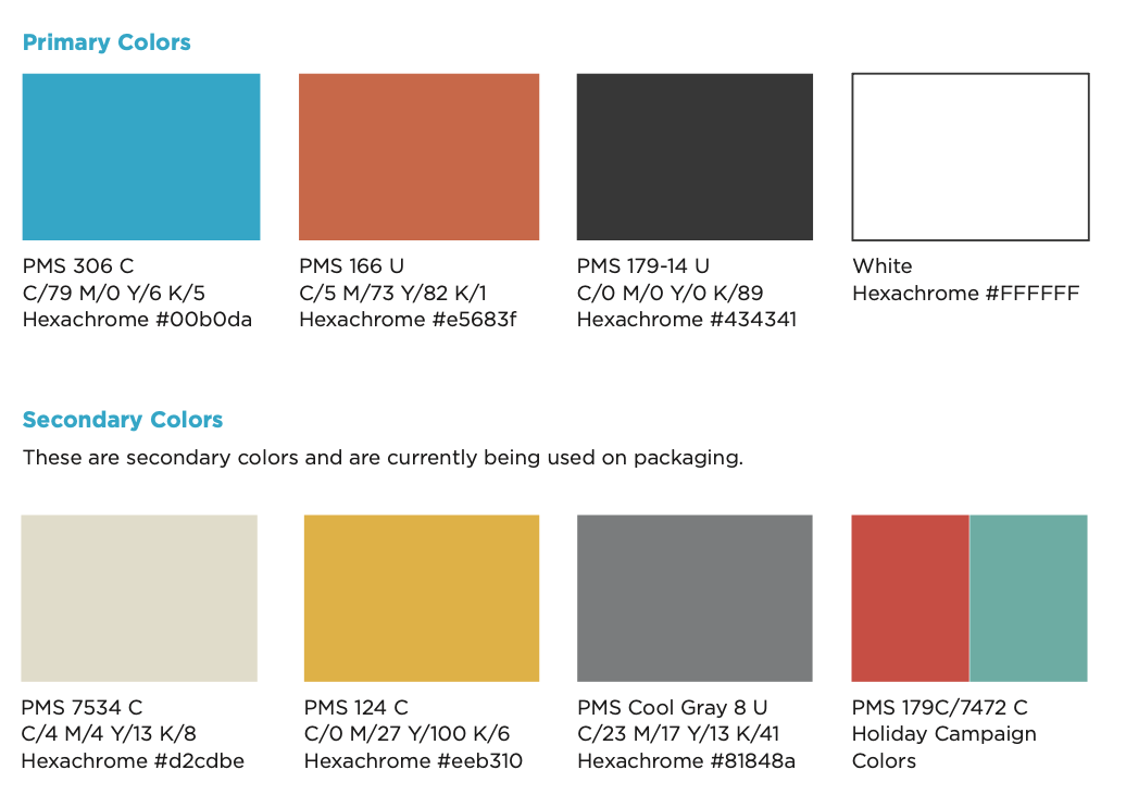
Because the logo has bright blue and orange, the resulting packaging system ended up being mostly gray.
NOW
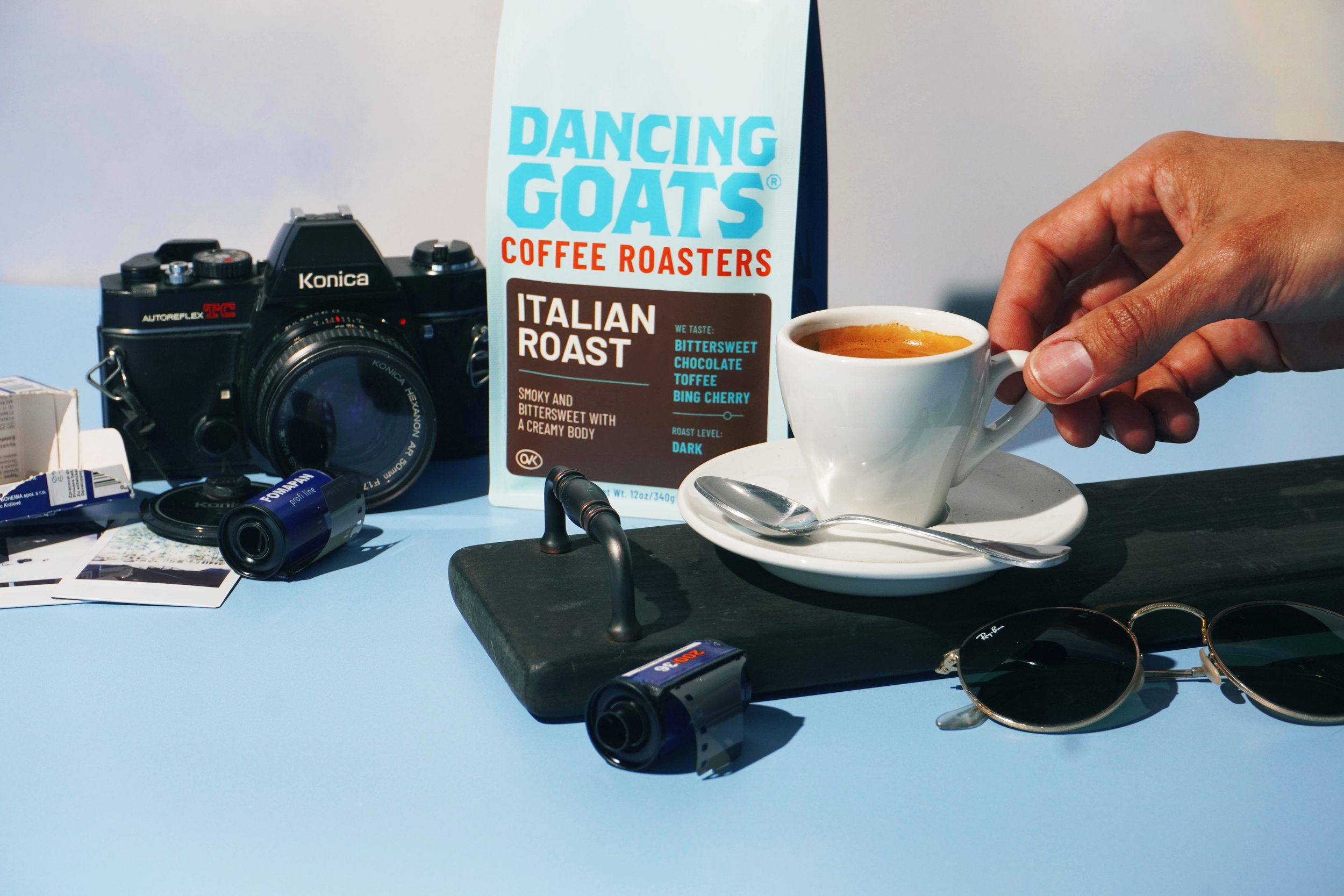
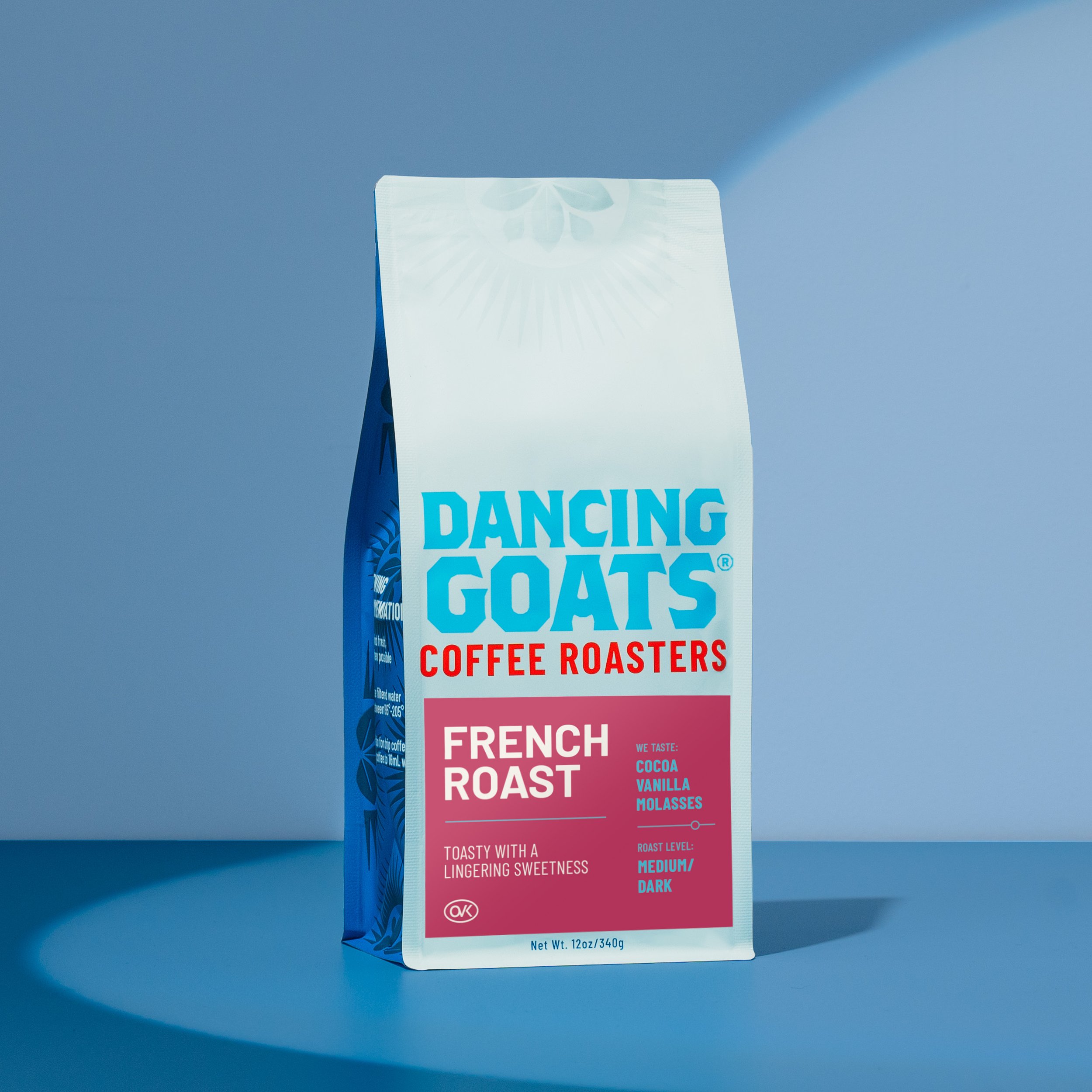
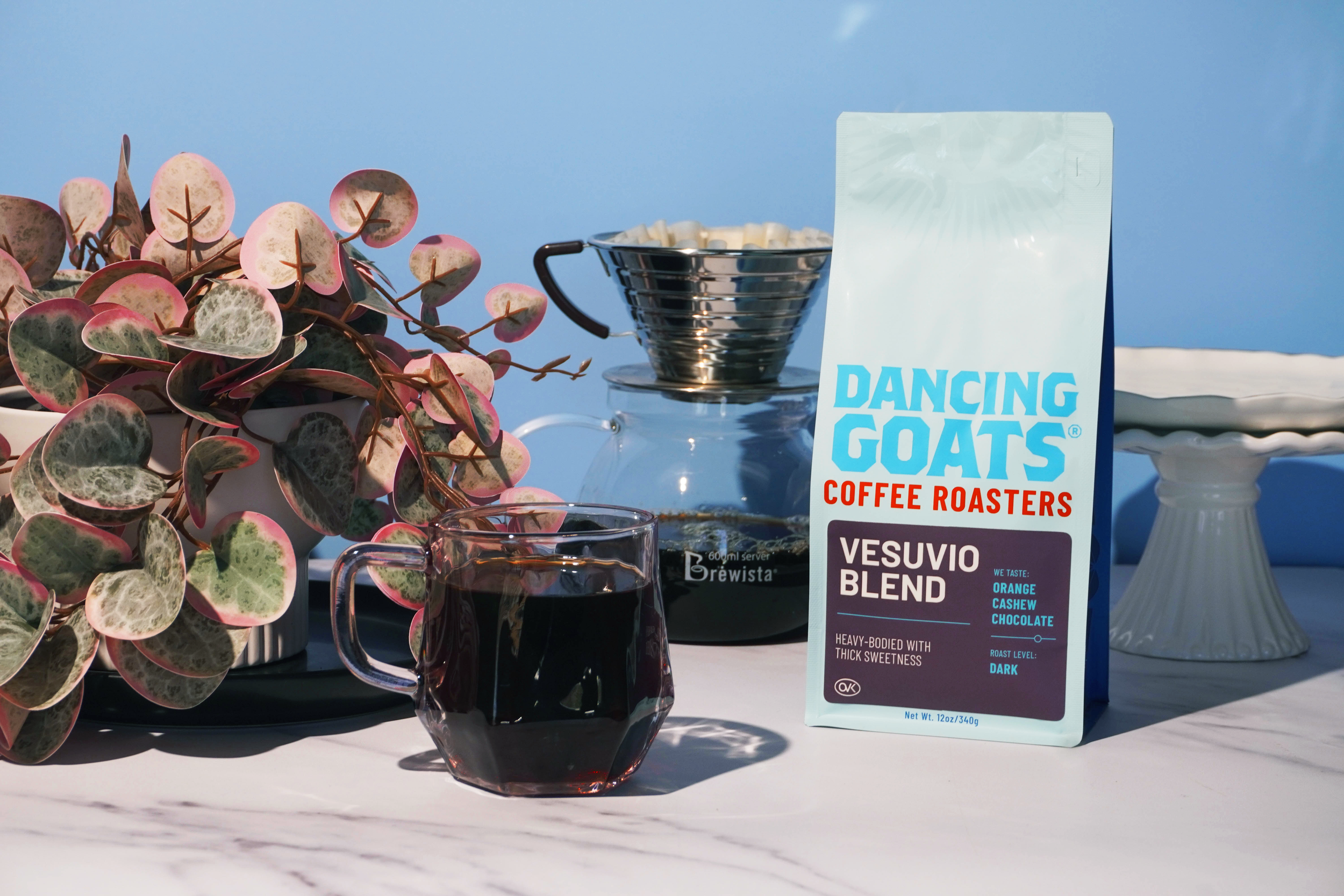
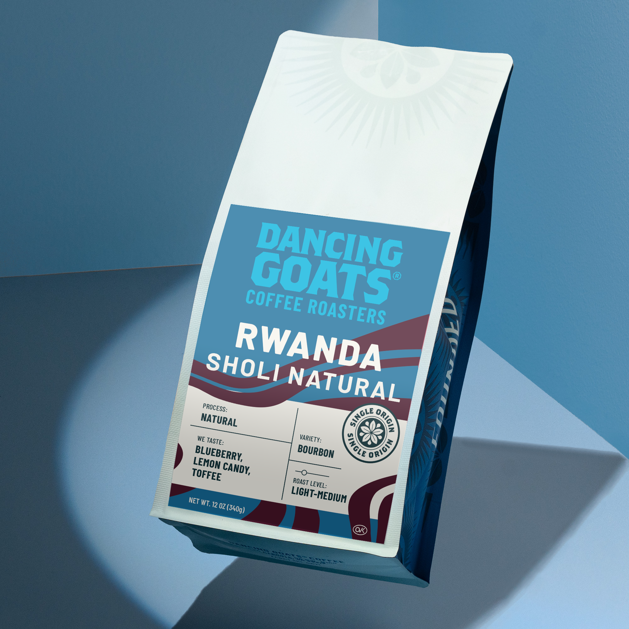
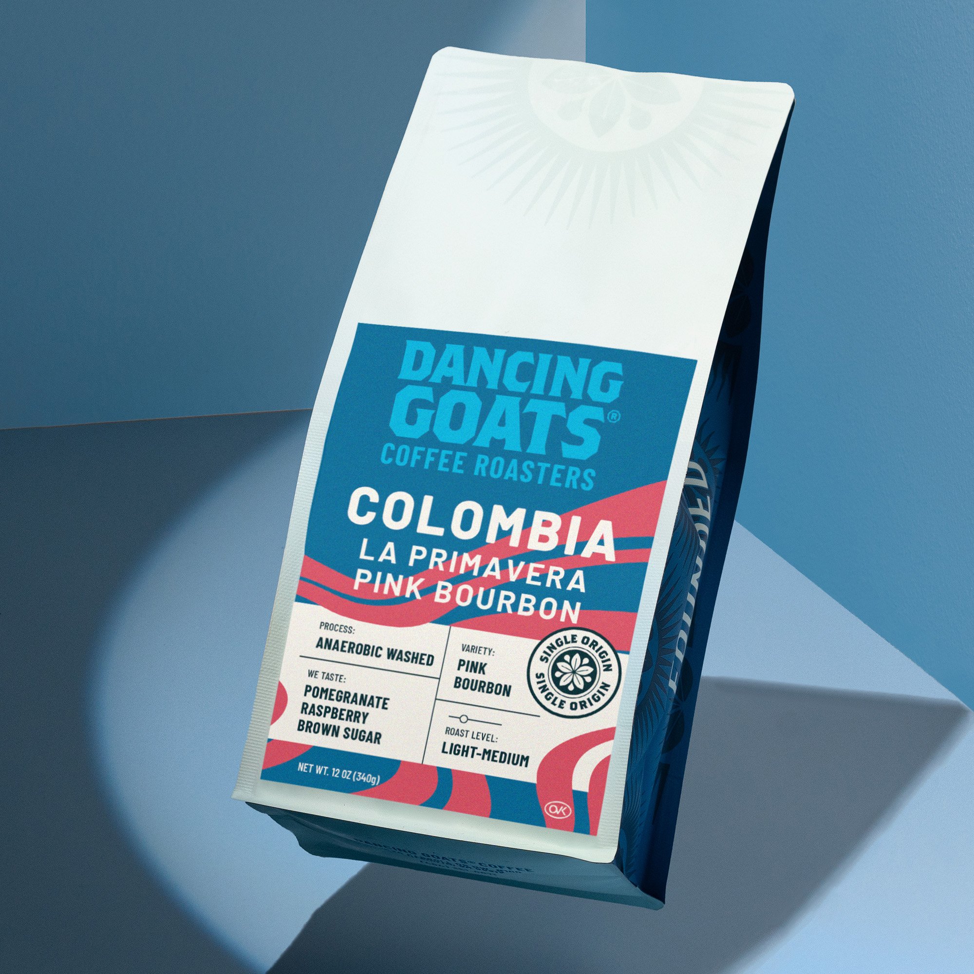
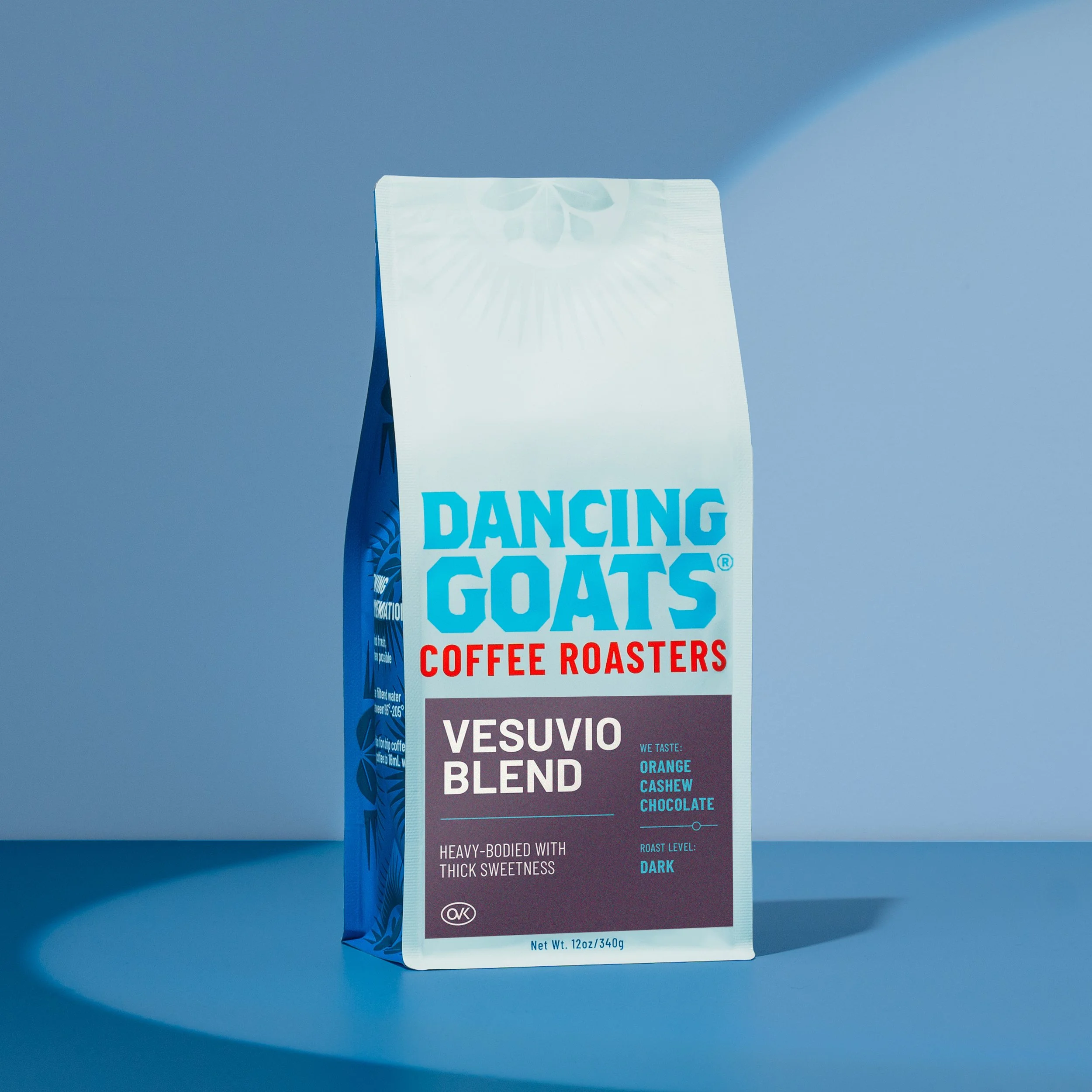
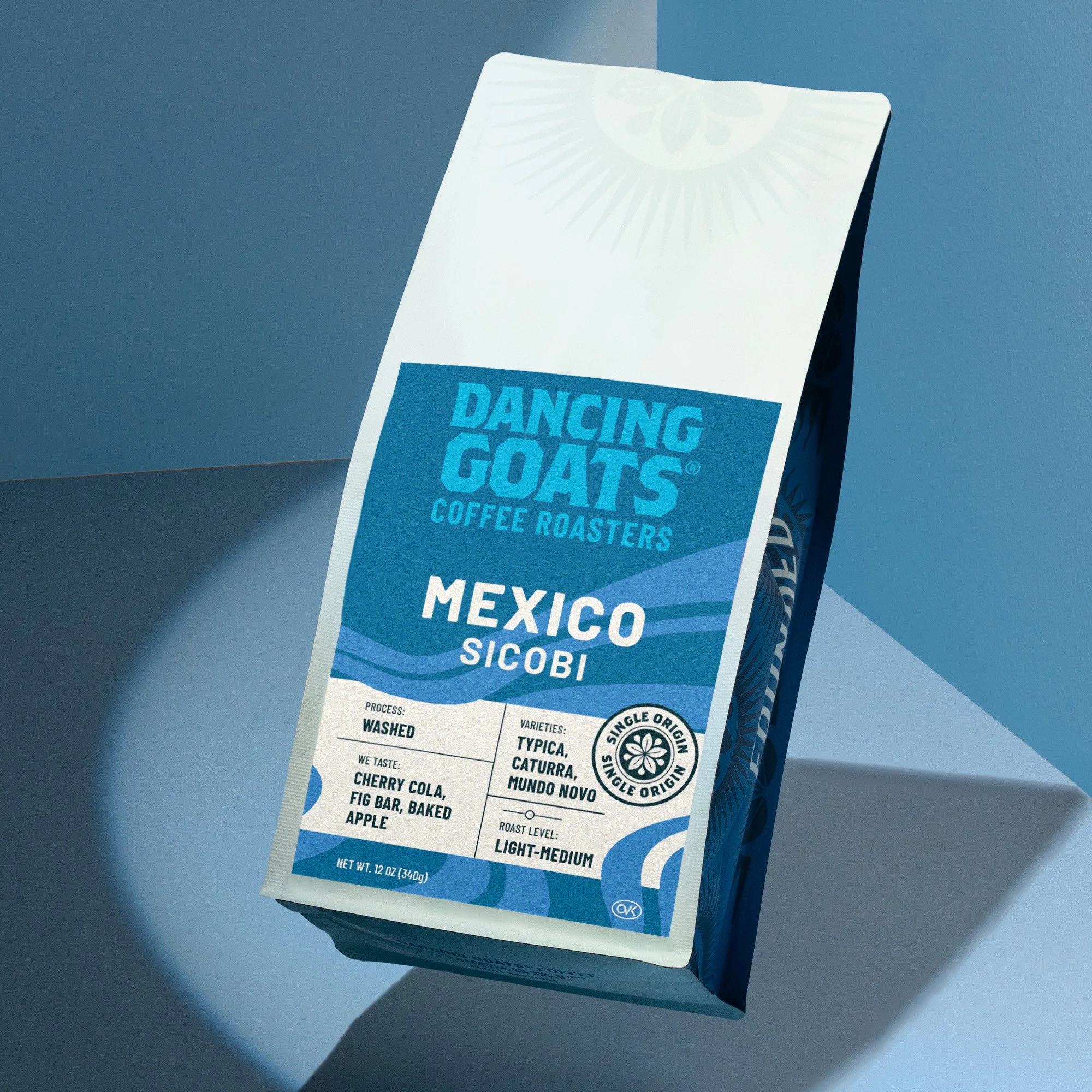
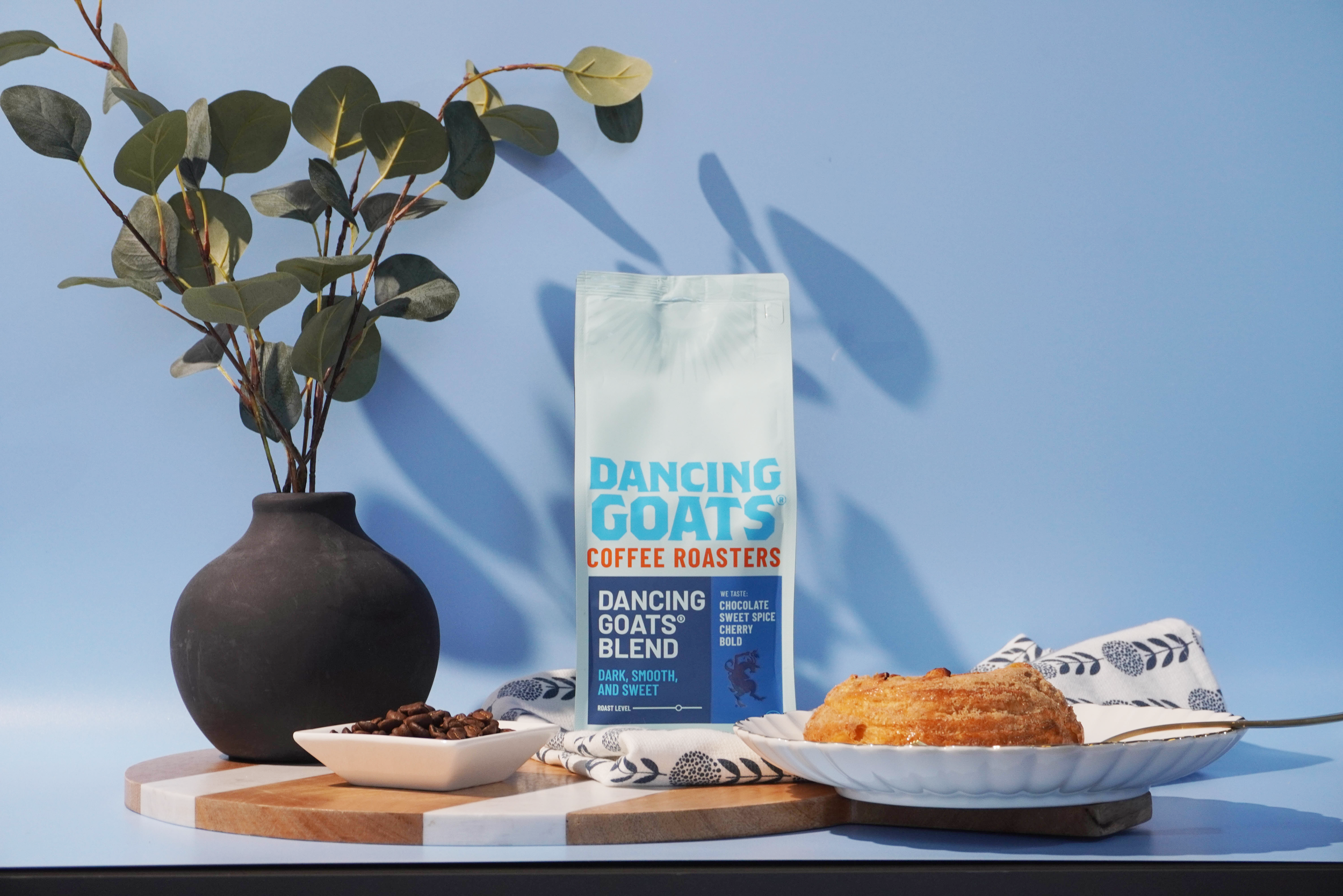
The packaging system needed to take a confident leap toward brand identity.
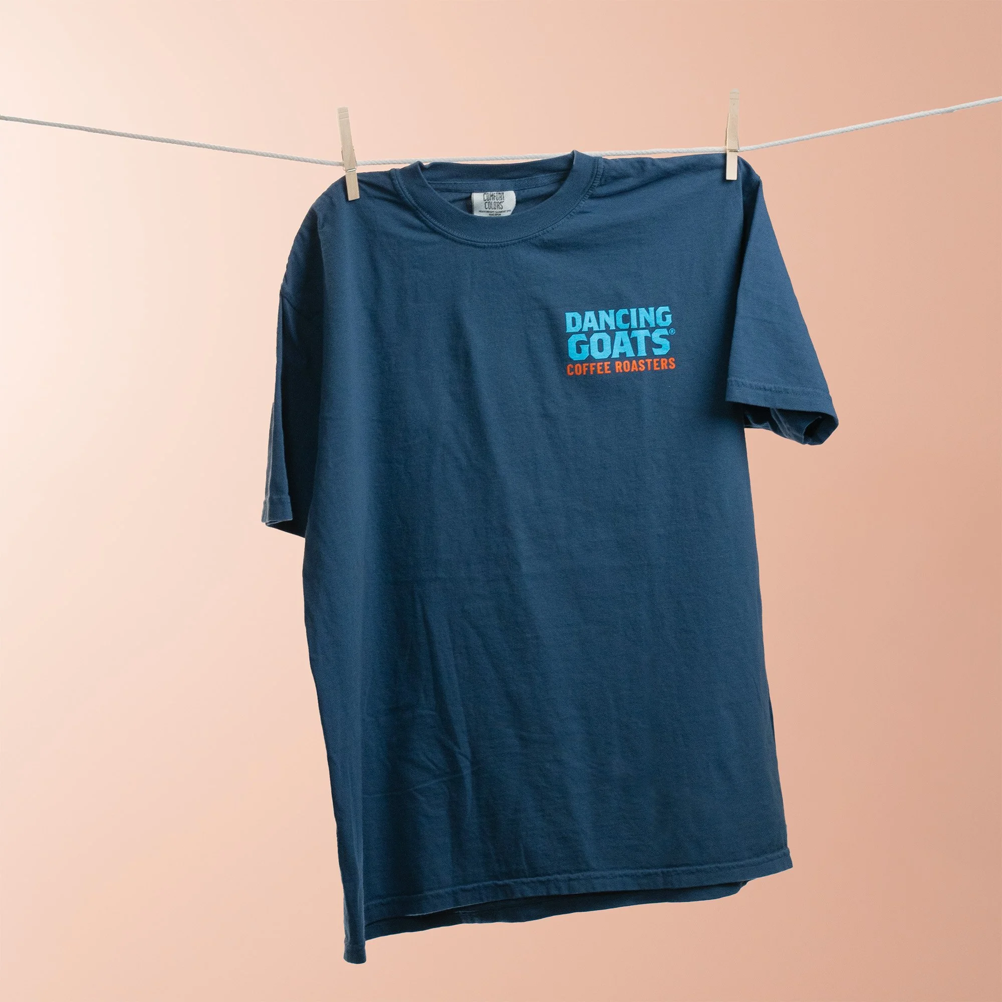
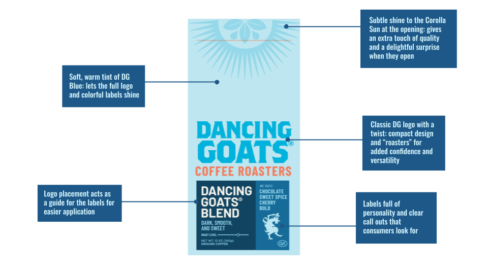
Adding “Coffee Roasters” to the logo created a more qualified impression of the brand
Replacing grays with blues made it feel cozier and less stark. It also allowed the brand to “own” blue as a brand color.
brand symbolism
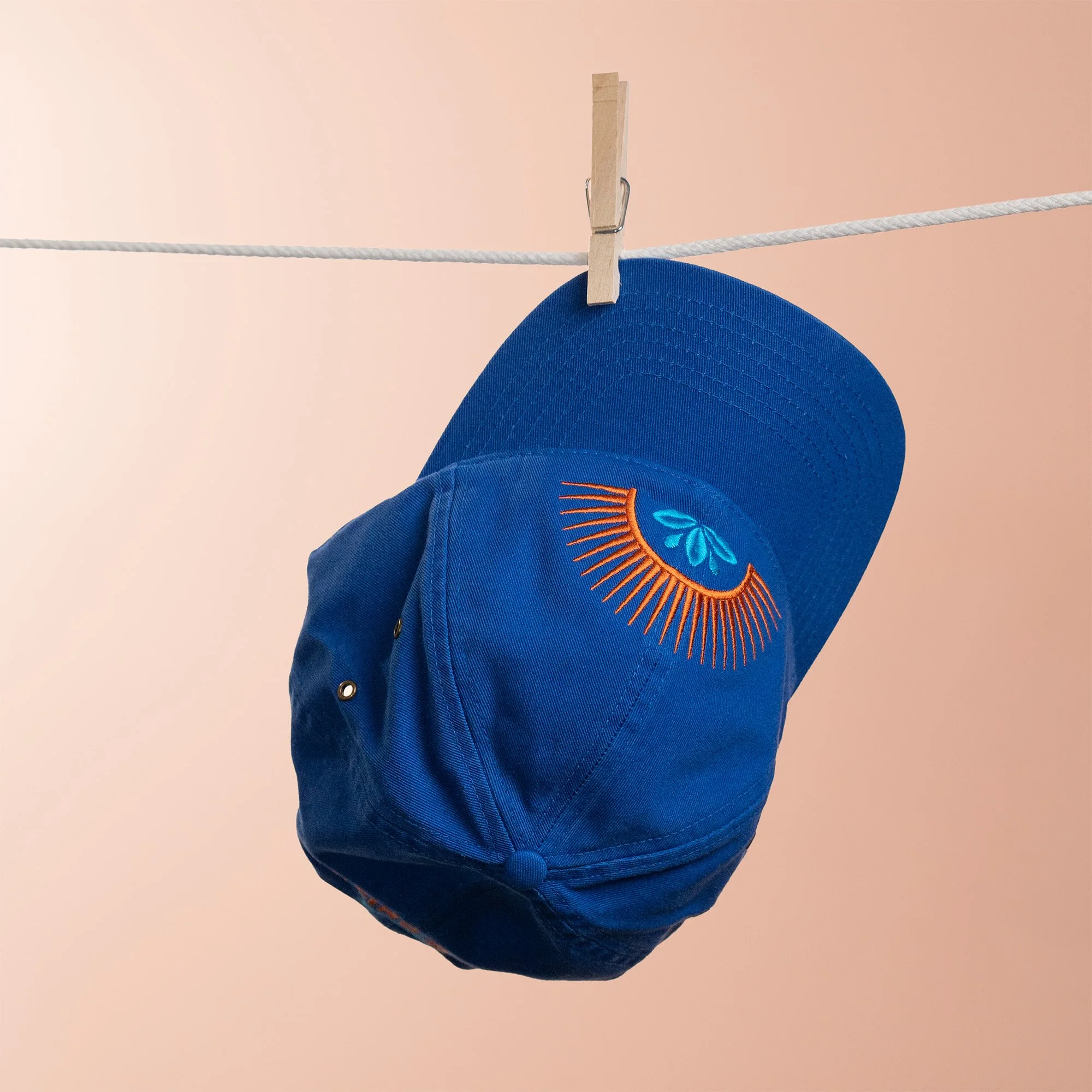
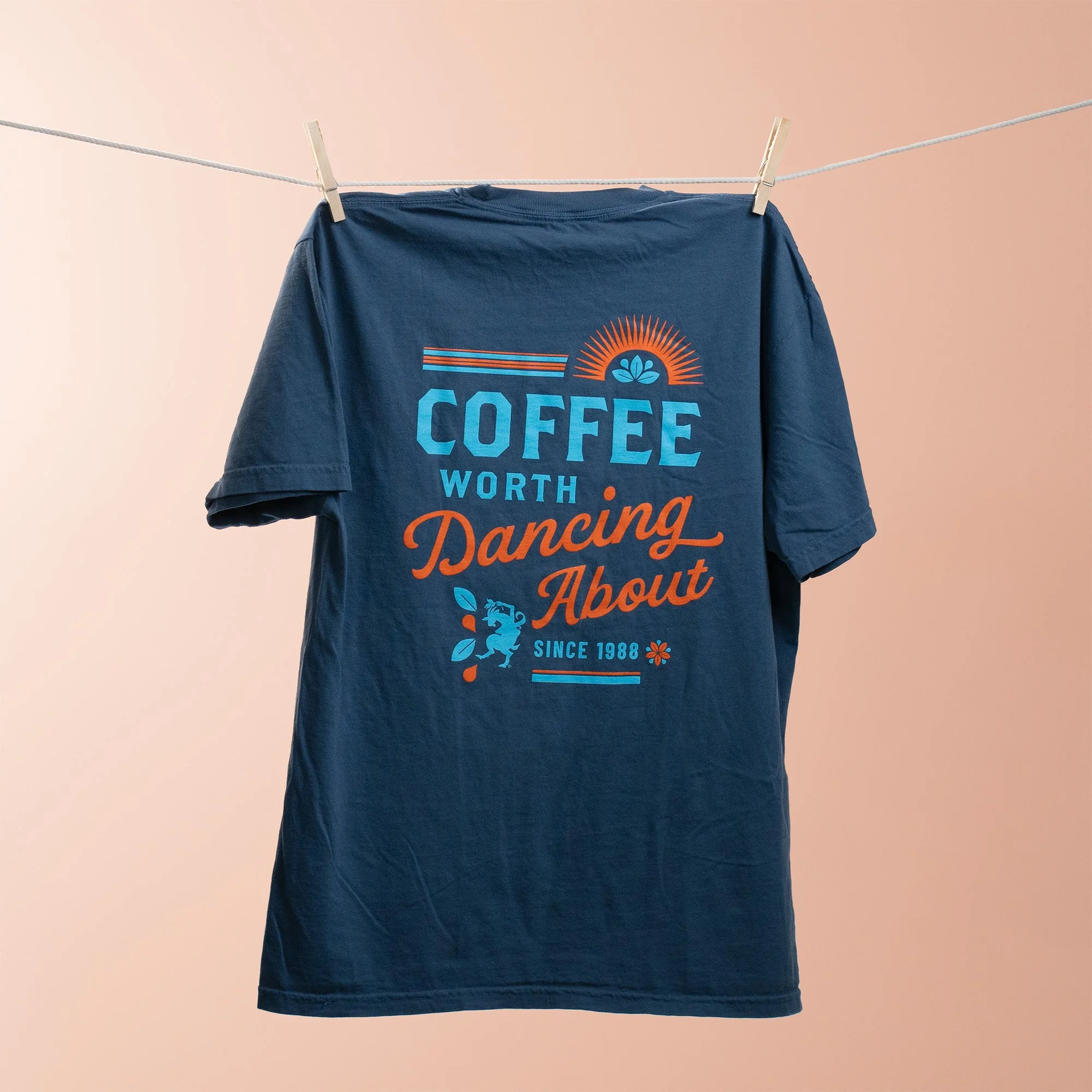
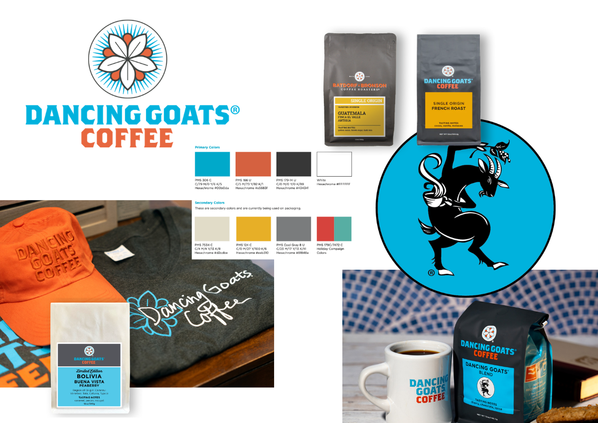
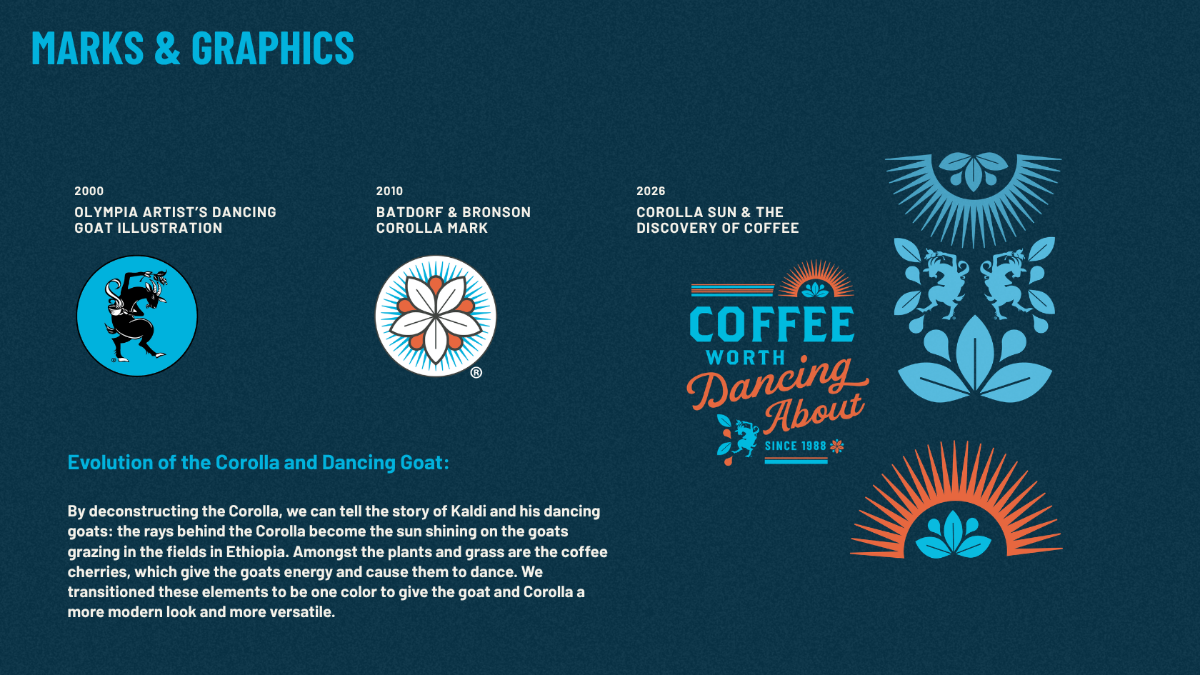
We want to honor DG’s story and tell it wherever we can. By deconstructing the “Corolla”, we can tell the story of Kaldi and his dancing goats: the rays behind the Corolla become the sun shining on the goats grazing in the fields in Ethiopia. Amongst the plants and grass are the coffee cherries, which give the goats energy and cause them to dance. We transitioned these elements to be one color to give the goat and Corolla a more modern look and more versatile.
COLOR PALETTE
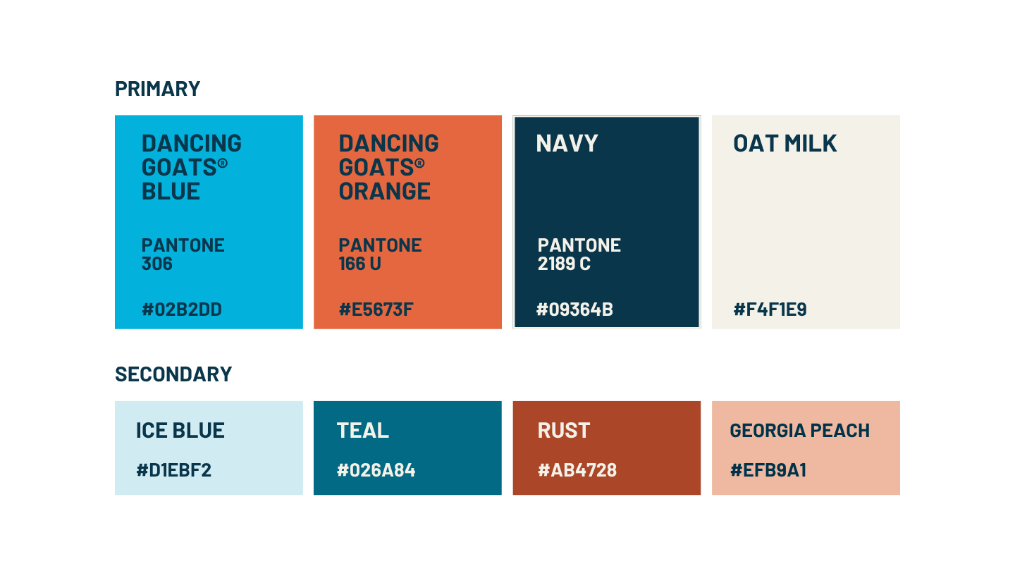
To maintain the brand’s integrity, the bright blue and orange needed to continue to be foundational to the visual story. The supporting palette previously felt somehow both juvenile and corporate, with shades of gray and pops of primary colors. To mature and modernize this scheme, I softened the dark tones to shades of navy and teal. The lighter pops of color still needed to be playful, but significantly more sincere. Because Dancing Goats® cafes have blossomed in the Atlanta market, a peach color felt like a necessity.